Trevar's Blogging Space

Depends very much on who "they" are

Page 2 of 2

Week 4 – Considerations of Screencast Videos as Learning Artifacts

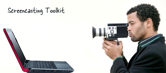
Many years ago, I was working in Distance Education Services at UVic. We developed online asynchronous courses in collaboration with subject matter experts (SMEs), instructors and program staff. The learning materials typically extended no further than text and images, and the occasional voiced-over PowerPoint. At some point, on some day, however, we decided to invest in licenses for screencasting software so we could be like this guy:

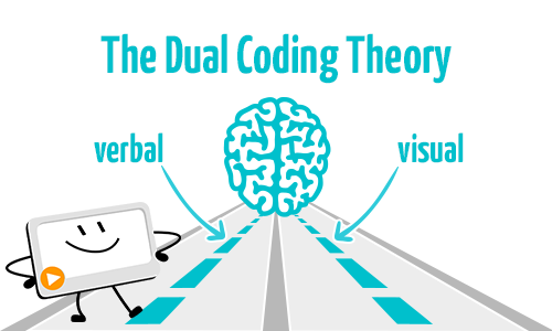
I have no idea if, at the time, my colleagues were thinking about Multimedia Learning Theory and the principles we’re learning about in EDCI 337. However, many of our courses involved guiding students in learning different software applications, and screencasting was a natural fit – why use pictures and text when you could demonstrate functions in a video? We anticipated that students, seeing the actions and hearing the actions being described, would learn more quickly and efficiently, and that there would be less room for misinterpretation than there would be with just text and images. Indeed, this is supported, for instance, by the spatial and temporal contiguity principles – a sentence or paragraph, followed by an image, is neither as ‘close’ in time or space as a video with narration. It also allows us to take advantage of the Dual Coding Theory, engaging both human input channels simultaneously.

What we did not consider at the time was the time and effort required to create and update such screencast. We thought initially that, once we became proficient with the screencasting software, we would be able to produce screencasts in very short order – that it would in fact cut down on our development time. In practice, the stages of screencast preparation look like this:

  1. Create a storyboard, including writing out the text to be narrated and actions to take. After all, we wanted to make the video clean, concise and effective, and include an accurate transcription.
  2. Prepare the ‘stage’ – set up the software or content to be demonstrated, remove extraneous artifacts from the screen.
  3. Practice at least once.
  4. Record the screencast, which might involve multiple restarts.
  5. Perform post-production editing (trimming, etc).

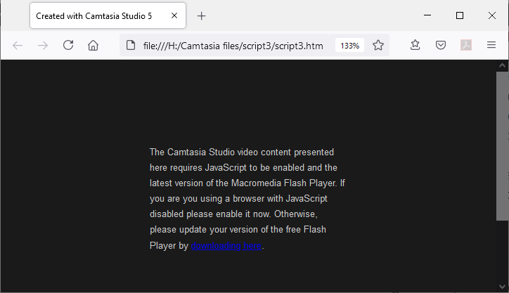
The update process turned out to be almost exactly the same, with the exception that the storyboard had to be merely updated rather than written in full. Problematically, the video can not really be edited itself – software, as we all know, changes incrementally over time, including in look and feel, and of course updates to such learning objects are often triggered by changes in the software. As a result, splicing a new segment into a video, while technically possible, is generally extremely disruptive – both as the video goes from one representation/version of the software to another and back; and also as the student sees part of the video show software that looks very familiar to their own, while other parts do not. And then sometimes technology changes dramatically, your video stops working altogether and you have no recourse than to go back to the beginning:

A couple of conclusion that we came to, in order to make the production and maintenance of screencasts more efficient, were:

  1. Keep them as short as possible – ideally no more than 2-3 minutes. This makes recording and re-recording much easier, as mistakes don’t cause too much lost time. This also supports the Interactivity Effect – keeping it short causes students to engage interactively with the learning object, and in effect makes it easier for them to ‘rewind’ to the beginning of the topic.
  2. Always present an alternative. It takes very little time for a screencast to become out-of-date, and can take a lot of time to update it. If you present the video alongside alternative demonstrations such as text and images, you have the option of updating the text and images quickly, while hiding the screencast until you’ve had a chance to update it as well. This is one of the ways in which a thorough storyboarding process can really pay off down the road.

The reality is that screencasts do take time, consideration and effort to plan, set up, produce and edit. It can go quickly, but the results are likely to be suboptimal, as in the following screencast. I recently delivered a short tutorial to fellow staff on the use of ‘Quick Links’ in Brightspace, and for the purposes of this week’s activity, make a short screencast to capture the basics of that topic. I spent approximately 10 minutes preparing for it (outside of the preparation I did for the initial, live presentation a couple of weeks ago) and did it in 2 goes for a total of approximately 20 minutes of effort:

As you can see, there’s lots of room here for improvement – Assignment 3 perhaps???

Also, for fun, totally unrehearsed, an attempt to give a bit of guidance to fellow n00b fire mages aspiring to do well in arenas:

Week 2 – Learner-centred design in infographics

Central to learner-centred design is the concept of scaffolding, where learners are combine prior knowledge with elements of the learning object to construct their own understanding. In order to support this, infographics need to make it easy for learners to find, combine and process the pieces of information they include.

Learning-theories.com describes the four elements that software needs to address the above and be an effective learning tool, but I have adapted them below for infographics. They are:

  1. Context: The goal, purpose, and audience of the infographic
  2. Interface: The aesthetics of the infographic
  3. Tasks: What the learners will do with the infographic
  4. Tools: What is needed in the infographic to support learning; these can include scaffolds
    (Adapted from https://www.learning-theories.com/learner-centered-design.html)

Context

The target audience of an infographic will be viewing it with prior knowledge, which will inform how they view the information, along with their reasons for considering it. Consider an infographic presenting the effectiveness of COVID vaccines. For vaccine enthusiasts, the information presented is likely affirmatory, but could help them in their conversations with the vaccine hesitant. The vaccine hesitant will approach the information with more skepticism. The data, choice of words, images and charts will need to draw the eye of the skeptic and present things in a less refutable fashion. As an example, a chart showing the inverse relationship between vaccination rates and hospitalizations could be more useful than bare statistics regarding the percentage-based effectiveness of the vaccines.

Interface

Here we need to pay close attention to some of the key theories we have learned so far. Cognitive Load Theory would tell us to try to deliver just one overall message in our infographic, and to keep the number of elements to the minimum possible, eliminating anything that doesn’t directly support the key information to be learned. The Signaling Principle would tell us to highlight the key pieces of information, by making them larger, bigger, brighter, etc. Finally, the Signaling and Coherence Principles indicate that we should use contrast (in size, colour, brightness, etc) to draw paths through the infographic for the eye to follow.

Tasks

The only real task assigned to the viewer of an infographic is to assimilate it into their own set of internalized knowledge. What they do with the knowledge as they construct and make a place for it internally is outside of the scope of the infographic. The assimilation, construction and internalization of the knowledge is aided by the final of our elements: Tools.

Tools

Each piece of information in an infographic is both a tool and a building block. A piece of text can allow a reader to make a connection between their prior knowledge and an image adjacent to the text, or the same image can help connect the text and a chart. Once connected, webs of understanding form and strengthen the connections around them. In this sense, a decision must be made when adding any item to an infographic – how well does the item connect to and support every other item in the infographic? The better it does this, the more pathways are made available to a learner, and the better they will be able to find a ‘best path in’ from their prior knowledge.

I think now I’d better get myself creating an infographic – seems like it could do a good job as a learner-centred learning object!

My PowerPoint Failures

Admittedly, I’ve never liked creating presentations. After I overcame the fear of public speaking that plagued me through my youth and early adulthood, I encountered PowerPoint in my professional life. I have never considered myself artistic, and have chosen to avoid the creation, adaptation, and even use of graphic materials – rather, I have chosen to focus on rhetoric for the purposes of self-expression. My PowerPoints, thus, have been spartan – white background, bullet points with summarizing words, etc. My PowerPoint presentations were boring, but with two purposes: a) to give my audience something to look at without either exposing my incompetence with graphics to them, or to challenge me to become adept at using graphics; and b) to let my words do the presenting. My slides have always looked like the following.

Following the rules we heard and read about this week, the above:

  1. addresses one thing (idea), with its components (maybe ok);
  2. has eight objects (slightly bad);
  3. is presumably not something I read verbatim off of the slide (good);
  4. has no illustrative image, but does have short text and relies on my narration (good-ish);
  5. has a white background (bad);
  6. slightly highlights what the most important idea is (the ‘Main Interface’) by having it at a slightly larger font size and at a different indentation level, but is overwhelmed by the word ‘Agenda’ (bad, because the eye is drawn to ‘Agenda’ rather than the actual topic);
  7. tells the story of what components the main interface includes, but, due to a lack of contrast, too many objects, and no graphic visual cues, probably fails to get the story across (kind of bad);
  8. uses a sans-serif font (good);
  9. has almost no contrast – font sizes are very similar; except for one bullet point, all are at the same level; there is no use of fading and highlighting to visually cue the audience (bad);
  10. uses a white background, which may draw the audience’s attention away from me (bad).

And then the Theory

Looking at my PowerPoint slide from the perspective of multimedia theories of learning, we can see that they fail to address most of what we have learned so far in the course readings, especially in “Principles of Multimedia Learning” (https://ctl.wiley.com/principles-of-multimedia-learning/).

The dual channel assumption holds that humans can process audible and visual information simultaneously. Inasmuch as the slide only contains topic words that I spoke to in the presentation, it does not take advantage of the audience’s capacity for visual input that could aid my message.

The limited capacity assumption suggests that humans have a limited capacity for quantity of information they can process at any moment. My PowerPoint includes too many items and insufficient contrast. Combined, these factors create a set of information that overwhelms rather than aids.

The active-processing assumption explains that humans learn best when they can connect different types of information and build their own mental models. My PowerPoint fails to attempt to provide anything beyond a topic and its components – it again fails to allow an audience to fully activate their potential for knowledge-building.

Finally, with respect to Cognitive Load Theory, my PowerPoint does not include any extraneous material, but, beyond the concept that the main interface comprises the indented components, includes very few visual clues about the organization of the slide topic (the main interface). Further, it only includes words, while Cognitive Load Theory’s various principles almost invariably include the concept that words are most easily processed when combined with graphic materials.

I can’t be lazy anymore

The conclusion I must draw here is that if I wish to convey ideas effectively in my work as a learning designer, teacher, presenter, and person, is that I cannot ignore graphic material any longer. My PowerPoint can be seen to be both ineffective, and, in some respects, counterproductive. It is both cognitively overloading, with too much white, too little contrast, and too many simultaneously-presented concepts; and also cognitively unengaging, with little organization of material and no graphical aids or clues. I thought that I could spare very little time and effort in the creation of PowerPoint slides, while relying on my verbal presentation to convey my ideas and information, but now I see that I am at best limiting my effectiveness, and at worst subverting it.

Newer posts »