Admittedly, I’ve never liked creating presentations. After I overcame the fear of public speaking that plagued me through my youth and early adulthood, I encountered PowerPoint in my professional life. I have never considered myself artistic, and have chosen to avoid the creation, adaptation, and even use of graphic materials – rather, I have chosen to focus on rhetoric for the purposes of self-expression. My PowerPoints, thus, have been spartan – white background, bullet points with summarizing words, etc. My PowerPoint presentations were boring, but with two purposes: a) to give my audience something to look at without either exposing my incompetence with graphics to them, or to challenge me to become adept at using graphics; and b) to let my words do the presenting. My slides have always looked like the following.
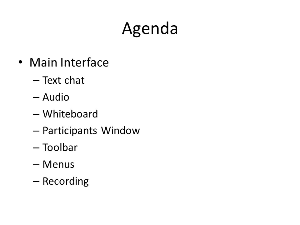
Following the rules we heard and read about this week, the above:
- addresses one thing (idea), with its components (maybe ok);
- has eight objects (slightly bad);
- is presumably not something I read verbatim off of the slide (good);
- has no illustrative image, but does have short text and relies on my narration (good-ish);
- has a white background (bad);
- slightly highlights what the most important idea is (the ‘Main Interface’) by having it at a slightly larger font size and at a different indentation level, but is overwhelmed by the word ‘Agenda’ (bad, because the eye is drawn to ‘Agenda’ rather than the actual topic);
- tells the story of what components the main interface includes, but, due to a lack of contrast, too many objects, and no graphic visual cues, probably fails to get the story across (kind of bad);
- uses a sans-serif font (good);
- has almost no contrast – font sizes are very similar; except for one bullet point, all are at the same level; there is no use of fading and highlighting to visually cue the audience (bad);
- uses a white background, which may draw the audience’s attention away from me (bad).
And then the Theory
Looking at my PowerPoint slide from the perspective of multimedia theories of learning, we can see that they fail to address most of what we have learned so far in the course readings, especially in “Principles of Multimedia Learning” (https://ctl.wiley.com/principles-of-multimedia-learning/).
The dual channel assumption holds that humans can process audible and visual information simultaneously. Inasmuch as the slide only contains topic words that I spoke to in the presentation, it does not take advantage of the audience’s capacity for visual input that could aid my message.
The limited capacity assumption suggests that humans have a limited capacity for quantity of information they can process at any moment. My PowerPoint includes too many items and insufficient contrast. Combined, these factors create a set of information that overwhelms rather than aids.
The active-processing assumption explains that humans learn best when they can connect different types of information and build their own mental models. My PowerPoint fails to attempt to provide anything beyond a topic and its components – it again fails to allow an audience to fully activate their potential for knowledge-building.
Finally, with respect to Cognitive Load Theory, my PowerPoint does not include any extraneous material, but, beyond the concept that the main interface comprises the indented components, includes very few visual clues about the organization of the slide topic (the main interface). Further, it only includes words, while Cognitive Load Theory’s various principles almost invariably include the concept that words are most easily processed when combined with graphic materials.
I can’t be lazy anymore
The conclusion I must draw here is that if I wish to convey ideas effectively in my work as a learning designer, teacher, presenter, and person, is that I cannot ignore graphic material any longer. My PowerPoint can be seen to be both ineffective, and, in some respects, counterproductive. It is both cognitively overloading, with too much white, too little contrast, and too many simultaneously-presented concepts; and also cognitively unengaging, with little organization of material and no graphical aids or clues. I thought that I could spare very little time and effort in the creation of PowerPoint slides, while relying on my verbal presentation to convey my ideas and information, but now I see that I am at best limiting my effectiveness, and at worst subverting it.
I empathize with you and had to look at some of my former content with a slight cringe. Knowing is half the battle – (I think that is an expression) so now you are equipped to inspire!
Cheers.